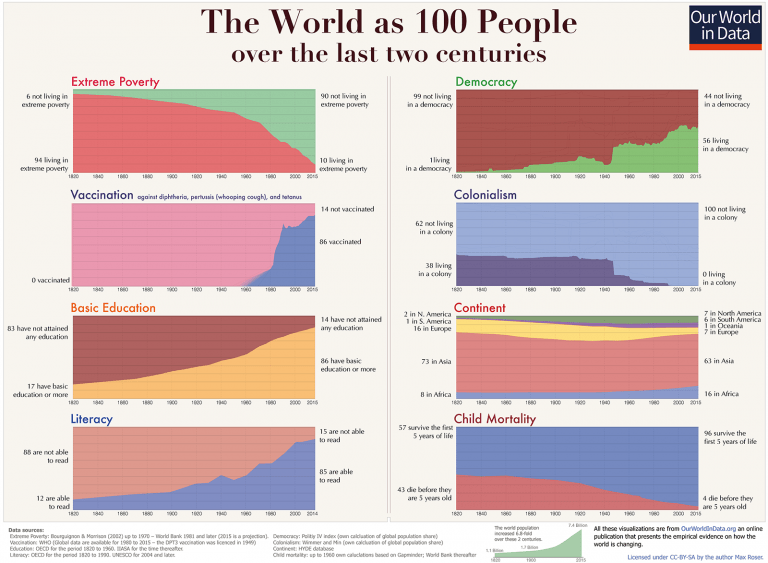
Max Roser hat die hier abgebildeten 8 Diagramme als Antwort auf die Frage, ob es uns heute besser geht als vor 200 Jahren, zusammengefasst. Die Bevölkerung wird dabei auf 100 Personen reduziert, die Ergebnisse sind eindeutig: Es geht uns verdammt viel besser als vor 200 Jahren.
Rosers Zusammenfassung in grafischer Form erwächst allerdings einer Kritik, die ein zentraler Argumentationspunkt im zugehörigen Beitrag ist. Wie kann, trotz der eindeutigen Zahlen, bei den Menschen der Eindruck entstehen, dass es uns wenn überhaupt, dann nur ein wenig besser geht als vor 200 Jahren. Rosers These:
I do think that the media is to blame for some part of this. This is because the media does not tell us how the world is changing, it tells us what in the world goes wrong. [It] focusses on single events and single events are often bad […] Positive developments on the other hand often happen very slowly and never make the headlines in the event-obsessed media. The result of a media – and education system – that fails to present quantitative information on long-run developments is that the huge majority of people is completely ignorant about global development.
The only way to tell a history of everyone is to use statistics, only then can we hope to get an overview over the lives of the 22 billion people that lived in the last 200 years. The developments that these statistics reveal transform our global living conditions – slowly but steadily. […] The difficulty for telling the history of how everyone’s lives changed over the last 200 years is that you cannot pick single stories. Stories about individual people are much more engaging – our minds like these stories – but they cannot be representative for how the world has changed. To achieve a representation of how the world has changed at large you have to tell many, many stories all at once; and that is statistics.
Amen!